



The first HD version of the Batman: Part 2 logo has been unveiled, signaling the long-awaited sequel is finally in production. Five years will pass between the films, and Batman 2 will finally be released in October 2027, ushering in a new chapter in Matt Reeves' Batman story. After years of development, official casting information and test photos have emerged in recent months, and now the full Batman: Part 2 logo has been revealed.
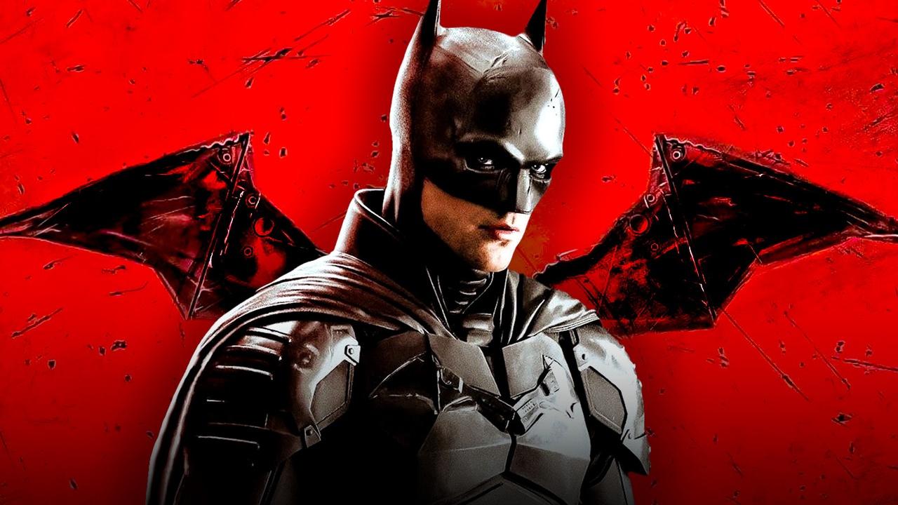
DC Studios unveiled a full-size, high-quality logo for "Batman: Part 2," continuing the iconography of the first film. The logo features "The Batman" in bright red letters, with a smaller "Part II" in the lower right corner. A shadow of Robert Pattinson's Batman emblem is visible in the center of the logo.
The Batman: Part II logo design remains unchanged from the original Batman, retaining the same color palette, font, and texture. The main additions are the "Part II" subtitle and the DC Studios logo at the top. The old DC Films logo has also been removed from the corner of the lettering.
When The Batman was released in March 2022, DC Studios had not yet been formed under the leadership of James Gunn and Peter Safran, and the film was being produced by DC Films in association with Warner Bros. Pictures. Now, Batman: Part 2 joins the DC Studios library, though it is located outside the DC Universe created by Gunn and Safran, being a project in the "Elseworlds" series.
While the Batman: Part 2 logo has only undergone minor changes, it's the first high-quality version officially unveiled. In recent weeks, Bat logos have been spotted on the Batman: Part 2 set, appearing on cameras, clapperboards, and props. Now, DC Studios has officially confirmed this by releasing the first high-quality logo for its 2027 film.
The Batman: Part 2 logo features an interesting aesthetic compared to the logos of previous Batman sequels.
Tim Burton's first two Batman films featured slightly different title designs in their logos and posters. The 1989 Batman film featured a bright yellow font, while the sequel, Batman Returns, used simple white lettering. In this case, Batman: Part 2 certainly makes a stronger impression, staying true to the franchise's design.
Christopher Nolan's Batman trilogy maintained a similar design, with minor changes to the logo and lettering, throughout the franchise's seven-year run. The second film, The Dark Knight, saw a slight refinement: the same font was used for the title in the logo, and a white and blue Batman emblem adorned the lettering. This represented a departure from the steel look of the Batman emblem in Batman Begins, but in the third film, The Dark Knight Rises, the emblem changed again, becoming a pattern of cracked ice.
For the DCEU film Batman v Superman: Dawn of Justice, the logo design was designed to match Zack Snyder's Man of Steel, featuring Ben Affleck's Batman emblem in the background and Henry Cavill's Superman "S" above.
The most noticeable difference between the new Batman 2 logo and previous Batman films is its striking design. Reeves chose a striking red color that contrasts sharply with the black, making the Dark Knight logo the most striking in cinema since 1989, when the yellow Batman logo was featured.
Matt Reeves returns to direct Batman: Part 2, with Robert Pattinson, Jeffrey Wright, Andy Serkis, and Colin Farrell returning to star. Filming is currently underway for the new DC Studios film, with a theatrical release scheduled for October 1, 2027.
The Batman: Part 2 logo is simple yet effective.
There's nothing difficult to decipher about the official logo for Batman: Part 2. It simply follows the style established by the 2022 Batman film and still looks impressive.
Some expected, or perhaps even hoped, that the logo's image, or at least its color, would change to further emphasize that Batman: Chapter 2 is a new chapter in the same franchise. Any design changes could hint at what to expect from the new film, but DC Studios hasn't revealed anything at this time.
It's worth noting that HBO's Batman spin-off series, Penguin, also used similar red lettering and font in its logo, cementing it as the signature look of Reeves's epic Batman crime saga.
The unified logo design promises audiences that this will be a direct sequel to The Batman. Despite a five-year wait, Batman: Chapter 2 retains the same core cast and creative team, which will only expand on what audiences loved about The Batman, rather than deviate too much from it. When the film finally hits theaters in 2027, audiences will be treated to the next chapter of a beloved franchise, and maintaining a unified logo design only reinforces this idea.