






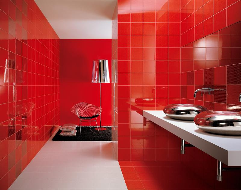
Red is the most emotional and provocative color in the palette. It is associated with passion, energy, and activity. But its intensity requires careful use in interior design, especially in spaces like the bathroom.
Based on color therapy, red stimulates the nervous system, increases blood pressure, and boosts appetite. Therefore, it's not recommended for bedrooms and children's rooms in large quantities. However, in the bathroom, where we spend little time, it can be a source of energy in the morning.
How to Use Red in a Bathroom
The main principle when working with red is balance. In my projects, I use a 70/30 formula: 70% neutral background (white, gray, beige) and 30% red.

Proven methods for introducing red color:
Accent wall
A single wall entirely covered in red tiles creates a striking focal point without overwhelming the space. In a narrow bathroom, this could be the end wall, which will visually shorten the room.
Niches and panels
Built-in niches framed with red tiles or decorative panels are an elegant way to add color. In a project for an apartment in central Moscow, we created a niche behind a backlit mirror, creating a striking art piece.
Combined styling
Checkerboard patterns, horizontal stripes, geometric patterns—red combined with white or black looks stylish and modern.
Review of red tile manufacturers
Italian factories are trendsetters in the production of colored ceramics. Over the years, I've identified several brands offering the best collections of red tiles:
FAP (Italy)
The Cielo collection features a rich red with minimal seams. The Voyage collection features more muted terracotta shades with striped detailing.
Atlas Concorde (Italy)
Adore is a ceramic tile collection featuring floral decorative elements. Gioia offers sets with ready-made panels.
Kerama Marazzi (Russia)
The Sakura collection features elegant designs on a red background, suitable for walls and floors. The quality is comparable to European counterparts at a more affordable price.
Color combinations: from classic to avant-garde

Red + white
A classic combination that never goes out of style. White softens the aggressiveness of red, creating a fresh and energetic interior. I recommend a 1:3 ratio.
Red + black
A dramatic and elegant combination for spacious rooms. To avoid gloom, add metallic accents (chrome, brass) and high-quality multi-layered lighting.
Red + gray
A modern, urban combination. Gray tones down the energy of red, creating a discreet and stylish interior.
Red + natural wood
A warm and cozy combination. The wood softens the coldness of the ceramic, creating a harmonious atmosphere.
Style solutions with red tiles

Chinese style
Red is a traditional color in Chinese culture, symbolizing good luck and prosperity. Pair it with black accents, bamboo, and hieroglyphs.
Art Deco
Geometric patterns, zigzags, combinations with gold and mirrors—red tiles fit perfectly into the aesthetics of the 20s.
Modern minimalism
Smooth, large-format red tiles, minimal detail, and hidden lighting—for those who love minimalist interiors.
Practical recommendations
For small bathrooms (less than 5 sq m), use red sparingly: in borders, decor, and accessories. In larger spaces, you can be more bold.
Lighting changes the perception of red. Warm light softens the hue, while cool light intensifies it.
Red tiles are the choice of bold and confident people. When used correctly, they transform an ordinary bathroom into a work of designer art, energizing every day.