








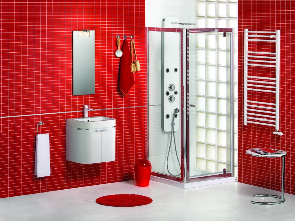
Red in a bathroom is a bold, emotional, and powerful choice. It can transform an ordinary room into a dramatic setting, energize you from the very beginning, or, conversely, if used incorrectly, cause irritation and anxiety. This color brooks no half-measures or compromises; working with it requires taste, a sense of proportion, and an understanding of the basics of color psychology. If you feel ready for this experiment, the result can be stunning—your bathroom will become the most vibrant and memorable space in the house.
Historically, red has been associated with vitality, passion, activity, and leadership. It stimulates the nervous system, increases blood pressure and heart rate, and encourages action. This is why it's often used in fast-food restaurants and on promotional signs. In the home, especially in the bathroom, where we seek relaxation, this effect needs to be carefully softened and balanced. The key to success lies not in an all-out color scheme, but in measured, thoughtful use as an accent or background, paired with calming colors.
The psychology of color and its influence on the atmosphere
Before buying red tiles, it's worth honestly answering these questions: how often do you use the bathroom, and what do you typically do there? If it's a place for a quick morning shower and evening wash, a vibrant red will help invigorate you and prepare you for an active day. However, if you enjoy long soaks in the bath with a book, too much bright color can interfere with relaxation and cause subconscious tension. However, there's a solution here too: use muted, deep shades of red—burgundy, wine, terracotta, and dark brown with a red undertone. These colors are more refined, complex, and don't have the same aggressive impact as pure scarlet.
Lighting is also important to consider. In bright, especially cool, light, red will "shout" even louder. Warm, diffused, subdued lighting will soften it, making it more velvety and deep. Designers often use this technique, combining red walls with warm backlighting on niches, mirrors, and shelves. It's also worth remembering that red visually draws surfaces closer. This means that in a small bathroom, it can make the walls appear smaller. Large mirrors, glossy surfaces, and plenty of white will help offset this effect.
Good and bad combinations with red
Red alone in a bathroom is a risky choice. It looks much more striking and harmonious when paired with other colors. The choice of partner determines the overall mood of the interior.
- Red and white. A classic, foolproof, and most popular combination. White refreshes, dilutes the energy of red, and adds airiness and purity. The optimal ratio is 30% red and 70% white. For example, white walls and ceiling, red flooring, an accent wall, or furniture. Or vice versa: red walls and white bathroom fixtures and accessories. This combination looks modern, dynamic, and stylish.
- Red and black. A dramatic, contrasting, and very stylish solution. It creates an atmosphere of luxury, mystery, and glamour. To prevent the interior from becoming gloomy, it's important to add a third color—white or silver. For example, a black glossy floor, red walls, and white wall-mounted fixtures. Or black furniture, a red accent wall, and lots of chrome details. This combination favors clear geometry and minimalist details.
- Red and gray. A more subdued and sophisticated alternative to black, light gray or graphite perfectly complement red, making it more sophisticated. This combination is often used in loft styles or modern classics. Here, red serves as an accent against a calm gray base.
- Red and natural wood (beige, brown). A warm and cozy combination. Red, paired with wood or its shades, loses its aggressiveness, becoming more homely and down-to-earth. It's a great option for country, Provence, or eclectic styles. Red can be seen in patterned tiles, textiles, or accessories against beige walls and wooden shelves.
- Red and gold/brass. A combination of luxury and pomp. Gold faucets, mirror frames, and bathtub legs against dark red walls create a regal look. It's important to avoid a tasteless finish by using matte, muted metallic shades and noble red tones (wine, ruby).
Combining red with other aggressive colors, such as acid green or bright orange, is considered a bad idea, unless you're creating a pop art-inspired interior. Also, be careful with purple—they can create a heavy, oppressive atmosphere.
The use of red in different interior styles
Red is a versatile color that can be adapted to many styles by changing its shade and application.
Modern minimalism. Here, red is used sparingly and selectively. One accent wall, a red shower niche, a large red rug on the floor, or a wall-hung toilet with a red cistern (there are some). The lines are clear, the shapes simple, the color pure and rich, without halftones. Accessories and textiles in this case are best chosen in neutral tones—white, gray, or black.
Classic. Muted, sophisticated shades like burgundy, marsala, and burgundy are appropriate in a classic interior. These can be found in tiles with gilded trim, in the fabric upholstery of a banquette, in drapes, or in a luxurious carpet. Plumbing fixtures are typically white or cream, and the furniture is dark wood with gilded handles. Red here is the color of status and respectability.
Loft. Red looks natural in an industrial style, reminiscent of exposed brick and old factory buildings. You can use red-brown brick tiles or simply paint the wall a matte red-terracotta color. Pair with concrete or gray walls, black pipes, metal lamps, and a mirror in a simple frame.
Eastern style (Chinese, Japanese). In Asian traditions, red is the color of good fortune, celebration, and vitality. In Chinese style, it can be used in lacquered cabinets, silk textiles, and lanterns. In Japanese style, it's used more subtly: for example, in the form of a red wash basin against a background of light wood and bamboo. Patterns and ornaments should be traditional.
Practical tips for incorporating red into your bathroom
If you've decided on a red bathroom, here are some practical tips to help you avoid common mistakes.
- Start small. If you're unsure, start with accessories rather than decor. Buy red towels, a rug, a bathroom set, and a shower curtain. See if you like the color in such quantities. The next step is to paint one wall or tile it with red tiles. Only attempt a full-scale decorating project if you're completely confident in your choice.
- Use different textures. The same shade of red will look different on glossy tiles, matte paint, and a velvet towel. Combining textures adds depth and sophistication to the interior. For example, matte paint on the walls, a glossy red backsplash, and a shaggy rug.
- Don't forget about a neutral background. Even if you want a bright room, the eye needs to have a place to rest. Keep the ceiling, one wall, or most of the floor neutral (white, gray, beige). This will create balance and prevent the color from overwhelming.
- Think about lighting. As mentioned earlier, light dramatically changes the perception of red. Be sure to test how your chosen shade appears in evening and daylight in your specific bathroom. Use dimmers to adjust the light intensity and, accordingly, the mood of the room.
- Keep it clean. Water droplets, streaks, and limescale are much more noticeable on glossy red surfaces, especially darker shades. Be prepared to clean more frequently or choose matte surfaces, which are more forgiving of minor stains.
A red bathroom always makes a statement of individuality and boldness. It leaves no one indifferent: it either delights or evokes intense rejection. Therefore, this design is rarely created "for sale" but rather for personal use, reflecting the owner's inner world and personality. If this color resonates with your personality, don't be afraid to experiment. Carefully chosen shades, successful combinations, and attention to detail will help create not just a bathroom, but an art object that will fill you with energy and positivity every day.